Improving Microinteractions

Background
Microinteractions are the tiny details that shape how users feel about an app, from tapping a shuffle button to adding an item to a cart. In many apps, these moments are functional but lack clarity or delight. This project explores how redesigning microinteractions can remove visual friction and make everyday actions more engaging.
Goals


Storyboards
Each redesign began as a storyboard, mapping triggers, states, and feedback before moving into motion. By treating microinteractions as systems, I translated static flows into purposeful animations that improve clarity, responsiveness, and emotional impact


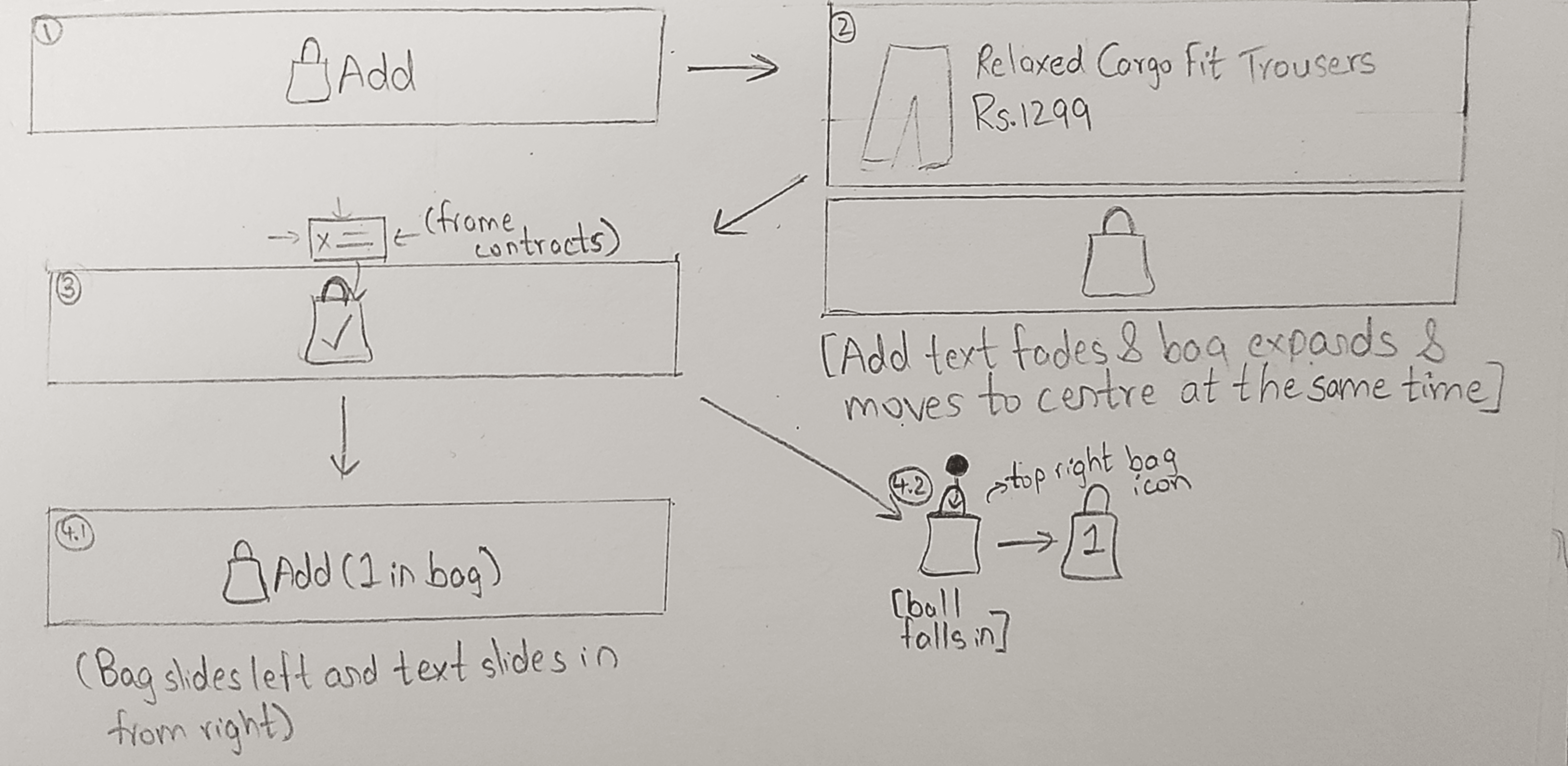
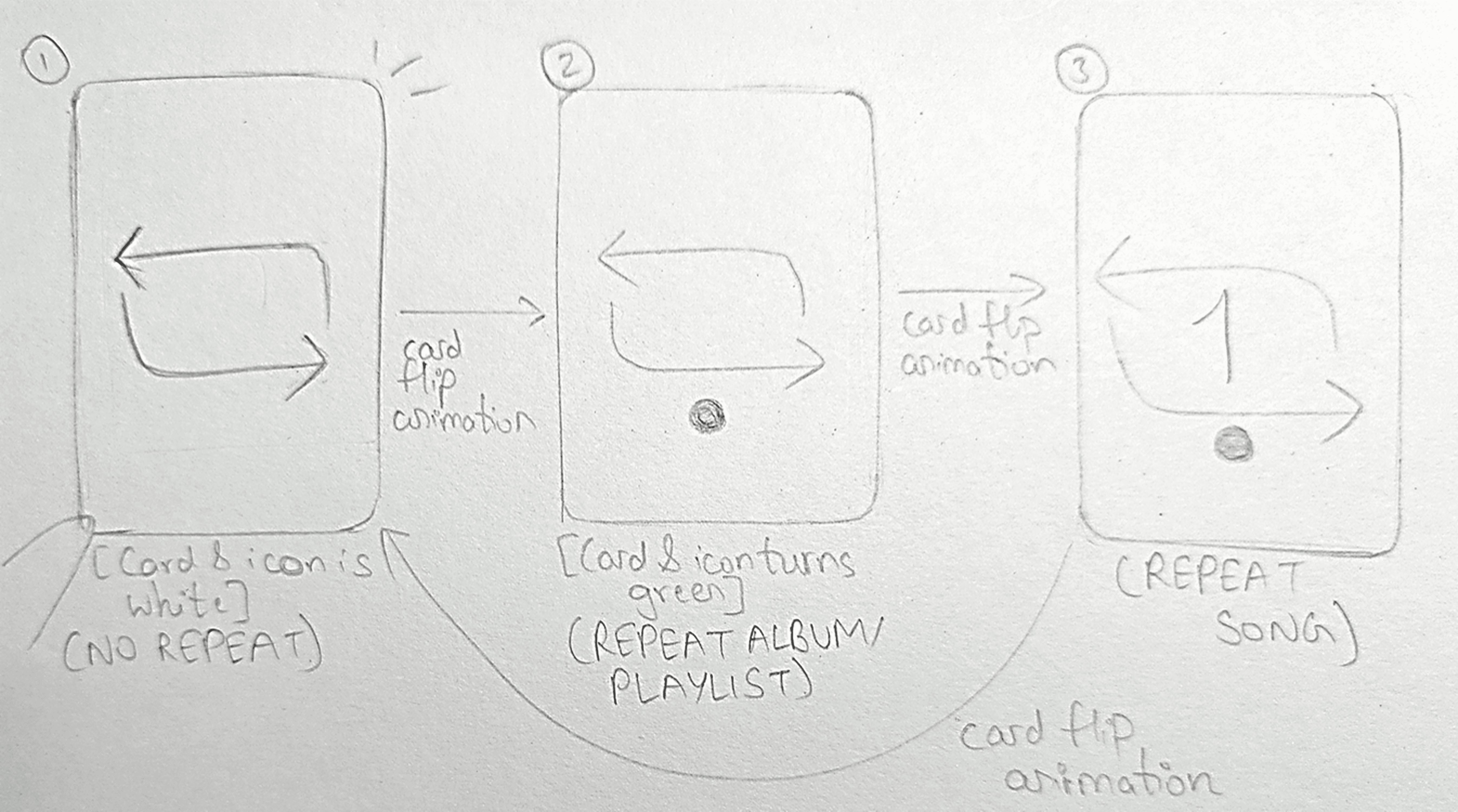
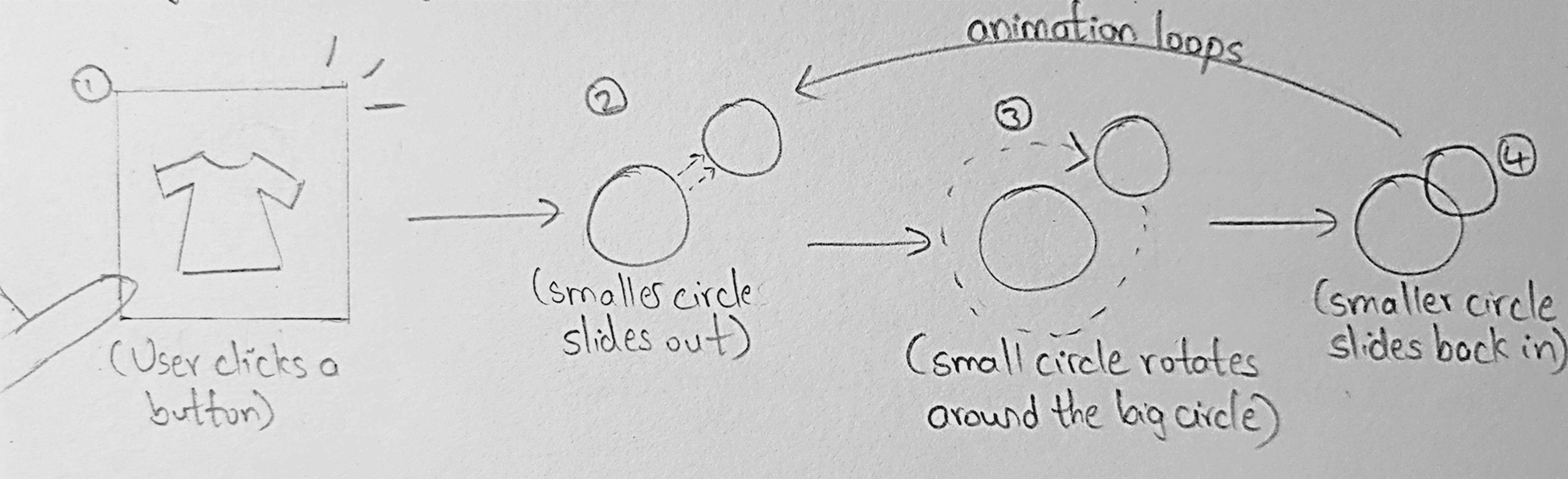

Featured Microinteractions
🟥 Old Interaction | 🟩 New Interaction
In this project, I redesigned 10 microinteractions across different apps, each addressing issues of clarity, speed, or delight. Below, I’m highlighting 5 selected examples that best showcase the variety and impact of these changes. The full set of 10 can be explored in the complete case study.
The videos have been slowed to highlight changes and animations.
Spotify Shuffle and Repeat
The original interaction felt static and unresponsive. The redesigned motion delivers instant feedback and smooth transitions, making the action feel clear, intentional, and satisfying.
KFC Splash Screen
The static splash sequence was reimagined as a brand-led loading moment. Falling drumsticks and a browning progress indicator transform waiting into a playful, thematic transition, making load time feel intentional rather than passive.
Discord Call Connection
Plain color codes made route status easy to miss. The new Wumpus animations with clear states turn connection feedback into something obvious, engaging, and full of personality.
Lifestyle Loading
The old screen was just a static image with no feedback. The new animated logo adds motion, personality, and brand recall, turning dead wait time into an engaging experience.
bigbasket Splash Screen
The static launch screen was redesigned into a structured reveal, turning the app launch into a deliberate, brand-led introduction rather than a blank wait.
Final Thoughts
Redesigning these microinteractions reinforced how small details shape the larger experience. A faster confirmation, clearer feedback, or smoother transition can turn routine actions into moments of clarity and curiosity.
Explore the Full Case Study
This overview highlights 5 redesigned microinteractions. The full case study includes all 10, complete with storyboards, before/after comparisons, and detailed justifications.